
Christine Danzi
Manager, UX Design
Tech consultant turned Java developer turned UX designer. Happy to have found the role that incorporates my interests in technology, psychology, and design.Over 10 years in the software industry and always ready for the next challenge.


Process HQ
Environment
Enabling users to understand their record and process data

Schmooz
Video Session App
Video scheduling application side project

RPA Designer
Redesign
Improving robotic process automation (RPA) task creation

Mentorship Program Application
Creating and automating the Appian Mentorship Program


Finspo - Finance Planner
A personal finance planning tool to track expenses, savings goals, and financial milestones. Developed using Lovable AI builder.

SAIL A11y Checker
Chrome extension for detecting SAIL A11y issues within Appian Interface Designer. Built using Kiro IDE.

Banana Split - Receipt Splitter
A simple tool for splitting shared expenses between two people. Developed using Lovable AI builder.

SAIL A11y Checker Demo

About
I was born in Japan and raised all over thanks to my dad's service in the Navy. Living abroad has given me a greater appreciation for different cultures and has left me with a bit of a travel bug.When I'm not designing (whether for work or personal projects), you can find me looking for a new recipe to try or training for my next race. Recent ones listed below:2025 Races
Heart Throb 5K, Rockin' River 5K, Donut Run 5k, Seaway 5K2024 Races
Spartan 10K, Rockin' River 5K, Golden Gallup 5K
Involvement
AI Working Group
Active AI Working Group member contributing to AI integration by creating Gemini Gems for analysis and persona development, while mentoring a junior designer on the A11y Gem
PresentAppianWomen / Mentorship Program
Board member, leader, and participant of Mentorship Program. Back in 2017, I presented the idea for a Mentorship Program, and I now have a committee that helps me facilitate programs for mentors and proteges. (370+ matches and counting!)
2016 / 2018 - PresentGraphic Design Guild
Member of Appian Engineering group that creates digital designs for department/team needs.
2018-PresentCommunity Committee
Member of Appian Engineering group that plans and facilitates social events for the department.
2019-Present
Accomplishments
2025 AI Impact Challenge Award Winner
On a team of three UX designers, won 2nd place for creating an AI-powered design system that automates design generation using UX best practices via an MCP Server2021 Impact Award Winner
Won this department award for my work leading the UX design vision for our Robotic Process Automation capabilities in the platform. I was the sole designer across five different teams. Now mentoring and onboarding new designers to the team.2021 NNg Certified, UX Management
In response to the growth of my current UX team, I wanted to learn more about different strategies when thinking about UX vision and how best to manage that vision across different designers and teams.2019 Richmond Marathon Finisher
Finally checked this off my bucket list! After months of training, I finished my first marathon.
Finish Time: 4:47:21
Contact
Feel free to connect with me on Linkden or send me an email!
Thank you
Looking forward to connecting with you!

FitHiits
Application for generating a workout playlist
Small Books
Mobile application for reading short stories
Remoga
Group for practicing virtual / remote yoga
Blooming Blends
Small business focusing on makeup and floral arrangements
Community Committee
Group that organizes events to facilitate community in department
Micro Workout
Group that practices short, daily 15 minute workouts
CRM Application
Logo concept for a Customer Relationship Management application

OWL Testing
Logo concept for OWL Testing framework
Quali-palooza
Code quality parody: Better code. Better quality. Engineering. (koala was mascot)


Landing Page Design

Process Metrics Dashboard

Environment Data Dashboard

Process Exploration Dashboard

Workflow Generator

Workflow Generator - Activity Focus

Process Activities Metrics

Process Activities Metrics Alternative

Operations Monitoring Dashboard

Process Activity Dashboard

Food Delivery Menu

Food Delivery Menu w/Mobile View


Schmooz
Video Session App

Problem
Provide a way for users to chat with key figures in an area of interest

Users
Figure - I want to be able to set up sessions for users to join (for a cost)
Follower - I want to be able to attend sessions of figures I'm interested in

My Role
Lead designer of brand exploration, design library, and core flows.
The Team
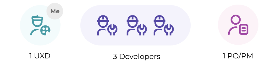
The team was composed of three developers and one product manager. Meeting weekly for about 3 months. I collaborated with PM to discuss core users and flows and worked with developers on design implementation.
Branding Exploration
Exploring different light and dark theme variations of the overall branding approach. In the end, the team liked the pomegranate direction.

Triangles (Dark)

Triangles - Dark Theme

Grapes (Light)


Grapes (Dark)

Pom (Light)

Pom (Dark)


Fine Tuning the Logo
Using the base pomegranate idea, iterated on different levels of detail and shape orientations. Eventually landed on the last two design iterations in the row below.

Accessibility Check
After landing on the logo shape, I wanted to verify the accessibility of the logo colors when used in different context (primary color used as background/text, secondary color used as background/text., etc. I wanted to find a balance between colors that could still relate to the pomegranate, but could still be used in an accessible way. Thankfully, there are also purple shades of pomegranates. The purple hues lent themselves to a better combination of accessible styles.

Final Logo
Based on the accessibility check above, landed on the final color scheme below. Just needed to be mindful that in certain contexts, we would need to use bold text styling to ensure the text/background combo was still accessible.

Info Page Exploration
The designs below, think through how to highlight the application as a marketing one pager on a website. The top designs were made prior to the color accessibility check exploration.

Version 1

Version 2

Version 3


These next design iterations show the change from the original color scheme above, to the purple-green color scheme. Also wanted to take into account how the layout would appear on desktop vs mobile layouts.

Alt designs with new color scheme and corresponding mobile layout

Viewing Sessions
One of the core actions for the figure is to be able to view any current future sessions scheduled with a follower. Confirmed sessions show the winning bid while in progress sessions have an in progress state.

Viewing current and future sessions

Analyzing Metrics
We also wanted to allow figures to view overall metrics related to the sessions that have been scheduled. The idea here was to provide a sample of metrics and gather feedback on the value that the provide for the user.

Viewing metrics and gathering feedback

Building out Design System
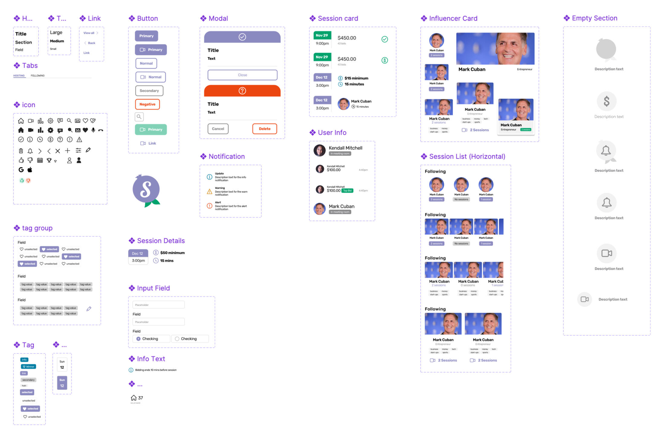
As different screens were being built out, I realized I also needed to setup a reusable set of patterns and components that could be utilized throughout the different scenarios. This helped speed up the design process and allow for a consistent feel across the user flows.
Including Metrics
It's important to think through what metrics we'd want to track as we build out the core user flows. This would help us understand the best areas to focus for improvement and for roadmap planning.
User Engagement Metrics
Number of sessions created by “Figures” (hosts) and attended by “Followers” (participants).
Average session attendance rate.
Repeat attendance: percentage of users who attend more than one session.
Usability Metrics
Task success rate: percentage of users able to complete core flows (e.g., booking a session, setting up a session) without errors.
Average time to complete key tasks (e.g., setting up a session, joining a session).
Number of support requests or reported issues related to session setup or joining.
Business Impact
Revenue generated through session bookings (if sessions are paid).
Conversion rate from visitor to registered user, and from registered user to paying participant.
Growth in user base (both “Figures” and “Followers”) over time.
Takeaways
This was was a great mobile first project to work on outside of my normal job responsibilities (which were mostly desktop designs at the time). It allowed me to think about how to fit content within smaller screen widths without sacrificing functionality. It was also a fun exercise in thinking about branding at a high level and carrying that branding throughout an application.
Mentorship Program Application

Problem
Turn manual process of using spreadsheeting and sending Google forms into a one stop shop for managing mentorship requests.

Users
Participant - I want to be able to sign up and see who my match is
Admin - I want to be able to see requests and send matches

My Role
Lead designer and developer for the entire application. Reviewed my designs with another senior designer.
Proposing the Program
Before I even designed/built the application, I first had to get approval to start the Mentorship Program. When I kicked off the program, it started out with a subset of the company (AppianWomen in 2017) and eventually expanded to the entire company (by 2023).You can read more about the journey from idea to application in this article I wrote for the Appian Blog:
Note: This was written back when I was still a Senior UX Designer
Below is the initial plan that I proposed to the AppianWomen board to start the Mentorship Program:
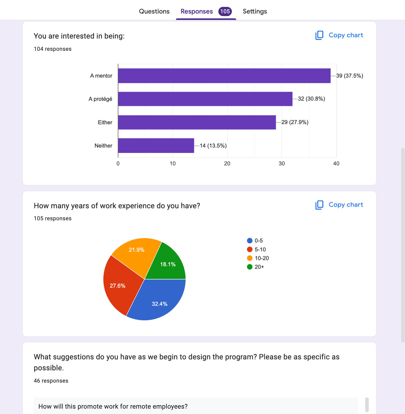
Initial Participant Survey
To confirm interest and to gauge what current employees would be looking for in a program, I sent out a survey to HQ based employees. For context, we envisioned starting the program with a subset of employees to learn and expand.The goal of the survey was to:
Confirm we had enough interest in the program
Understand a breakdown of experience levels
Solicit suggestions and desires for a mentorship program experience
The Team
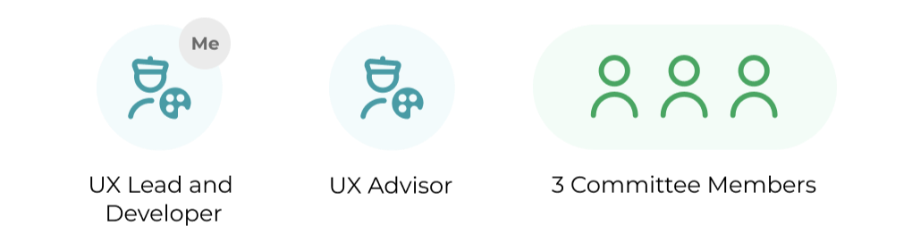
I led the design and development of the application during weekly development sessions. Another senior UXD would attend the sessions to learn more about Appian development and review my overall approach. I also had a program committee I eventually worked with to plan events for the program.
Application User Goals
The first few years of the Mentorship Program was a very manual process. To improve this experience, I first interviewed previous participants. This gave me insight into the current paint points of the process.As a participant, I want...
The ability to view a list of mentors and easily compare. Before: Users had to scroll through a slide deck to view a list of available mentors.
The ability to select their top three choices inline. Before: users had to manually compare and switch between the mentor slide deck and a sign-up form.
For the admin user, I essentially had to reflect on what I needed from the application. For the first 2 years of the program, I was the sole facilitator, so I knew exactly what I wanted from the admin page:As an admin, I want...
To view a list of all requests and have inline validation for repeat matches. Before: I had to use a spreadsheet to match participants
To auto send match via an email Before: I had to manually create each email, this took hours depending on how many matches we had)
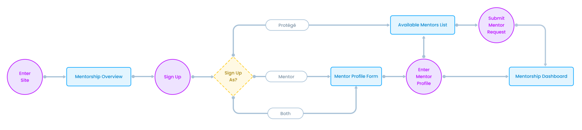
User Flow
As user enter the core Mentorship site, they will be presented with an overview of the program and a call to action to sign up. Different forms will be displayed depending on what the user chooses to sign up as: A protégé, a mentor, or both.
Wireframes
At a high level, I wanted to think through how to present core program information to the user while also allowing them to sign up and see the status of their assigned match.


Due to how the existing environment (that this application would live in) was already configured, I had to adjust how we ended up showing some of the information. Ultimately, the user would have a core landing page to review program information and then they would be redirected to their dashboard after signing up.
The New Experience
Signing Up
Now users land on a Mentorship Program dashboard and get an overview of what the program is about. They can sign up right afterwards without having to reference different documents/keep track of different links!

Home Page

Program Packet Snippet


Selecting Mentors
Right after signing up, proteges can view the list of available mentors without having to scroll through a slide deck. Makes it easier to see multiple mentors as once without needing to open up multiple tabs or find the separate sing up form.

New Experience

Old Form


Managing Matches
As an admin, I can now manage the mentorship timeline and see requests right in the dashboard. No more need for a separate google sheet to track requests.

New Admin Screen

Old Spreadsheet Tracker


Metrics + Impact
Developing this application has definitely made it easier and faster to make matches across the company. We initially started with a subset of participants and now it's a global mentorship program, which allows us to pair employees across teams and timezones! A few key highlights:
350+ matches and counting!
8 years of the program
5 years using this application


Takeaways
Going through a typical user flow and having prior user experiences as evidence allowed me to plan out what we needed in the mentorship dashboard. Even after the first round of designs, having real participants go through the flow again was valuable for future improvements. In the end, signing up to be a mentor or protege is a lot easier, and I have less documents to keep track of.
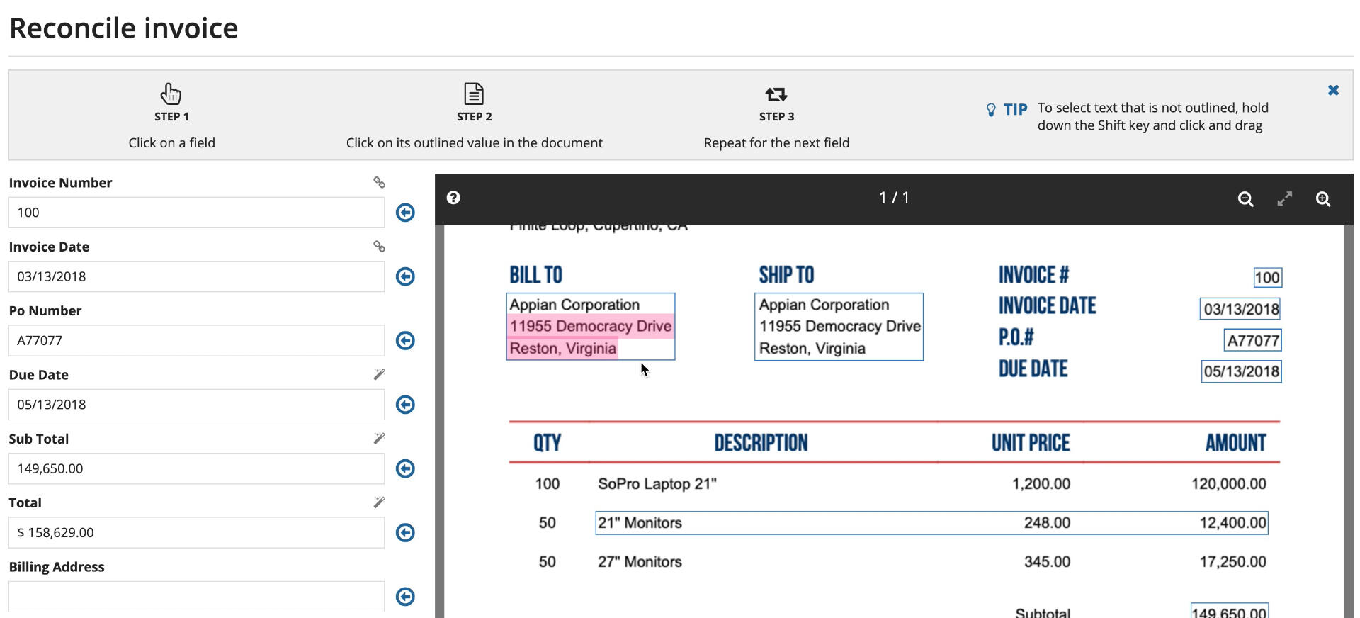
Document Extraction
Research
Conducted usability tests with different end users. Asked them to go through different document extraction scenarios: Gave them an invoice and asked them how they would extract certain data from the form.Findings
Most users just started to type into the form manually (they did not notice the automatic capabilities that the form provided)
When prompted to use the data extraction functions, they did not notice how to paste the data that was automatically copied
Users wanted more guidance on what was possible, in the end the feature was not walk up usable.

Setup and Cleanup section empty states

Designs
Since users were unaware how to interact with the document extraction form, we decided to provide instructional guidance at the top of the screen. When running another round of usability tests, users read the instructions right away and followed along. They were no longer typing in data manually but actually interacting with the form capabilities to extract data faster and more efficiently.
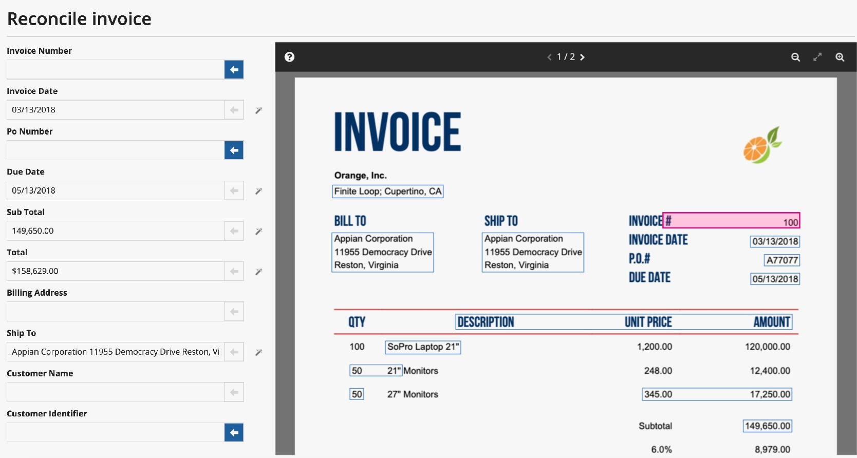
The next improvement was the copy and paste feature. Above you'll notice that when data is highlighted, arrows appear to the right of the input fields. During initial testing, users were missing this, so instead of keeping the paste functionality hidden, we added arrows inline with the fields. That way, they were already visible as users interacted with the form data.
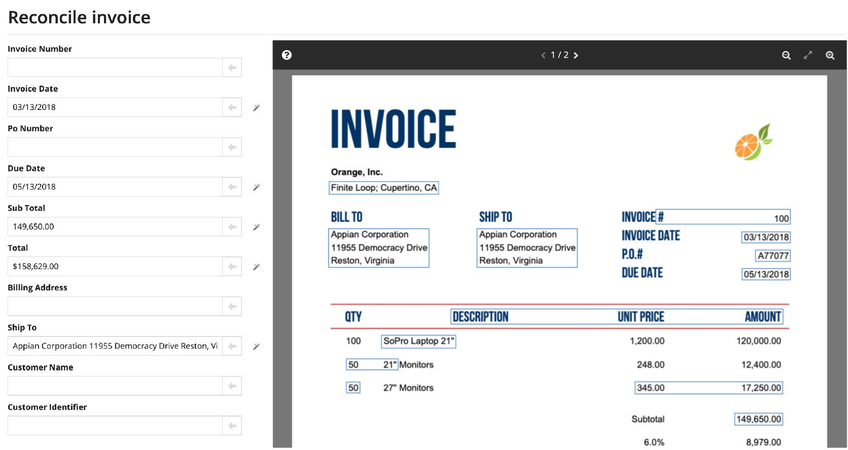
Upon selecting data in the document, fields that matched the data type should light up to indicate that clicking the arrow will automatically paste that value in the field. So much easier than manually types or having to click and drag to copy values from the document.
Takeaways
Giving users actual documents/scenarios is important to see how they will interact in their actual jobs. Sometimes it's better to give directions up front than assuming users will explore the functionality on their own.
RPA Designer
Redesign

Problem
Old RPA designer doesn't match the rest of the product, and it is hard to configure actions quickly

User
RPA Designer - I want to be able to quickly create RPA tasks within my processes. (Personas described more below.)

My Role
Lead designer on RPA squad. Collaborated with other designers in UX reviews.
The Team
I was the lead designer for the redesign effort. I collaborated with the PO/PM to discuss priorities and incremental changes to the designer. We wanted to ensure that there was parity with our existing designers. I would conduct UX reviews of in-progress tickets and provide implementation support alongside our developers.
Before
Configuring an RPA Task took a lot of clicks to drill into each task and configure each node. Connecting nodes to each other was not very obvious. For additional context, this designer experience was inherited from an RPA company that was acquired in 2020 (Novayre Solutions SL). It was my job to ensure design consistency with the rest of the Appian product.

Viewing RPA Task

Editing Task Variables


Personas
It's important to step back and understand the type of user we are designing for. Even when improving upon an existing design experience.

New User

Experienced User


Research
A general survey was sent out to get a sense of how much experience our Appian developers already had with using RPA tools, specifically Appian RPA. I also conducted usability tests to figure out existing pain points with the RPA Designer to target areas of improvement.
Some key areas after the Affinity Mapping exercise were: process variable creation, workflow design experience (starting workflow, linking nodes, multi-action configurations, etc.) We could use these pain points as a way to focus what ways we could improve the design experience.

Survey Results

Affinity Map of Results


Design Iterations
In general, we wanted to take the design direction away from the standard look and feel of a process diagram. The goal was to make it more obvious that an RPA task was a piece of a process workflow vs being confused for another process workflow. Due to this, we opted to try out design iterations with more of a top down flow with configuration panels on the side.
Popover Steps

Sub tasks as modal dialogs within step context

Nested Cards

Explores nested boxes to show hierarchy

Indented Cards

Using indentation to convey hierarchy

Tree Table

Showing RPA tasks in a hierarchical table

PROS
Keeps primary flow “simple”
Allows transitory “zooming” into specific sub-tasks… but only when a user wants it
Cons
Popovers from Popovers gets unwieldy
Pros
Shows the full hierarchy.
Collapsable tasks & sub-tasks allow an Automation Dev remove noise & focus.
Cons
Boxy. Nested boxes get hard to visually decipher if you go too deep.
Pros
Shows full hierarchy of tasks
Collapsing helps eliminate noise
Indentation is less boxy -- providing a “cleaner” looking UI while still visually showing hierarchy
Cons
Short process node names combined full width cards results in some wasted real estate
Pros
Shows full hierarchy of tasks.
The Tree Table Design Pattern could be used for managing Appian Objects as well, providing additional consistency between Object and Process management UIs.
Cons
“Searching” for a specific task inside of collapsed tree table can have challenging UX issues
Final Design
The final approach ended up being a combination of the "Nested Cards" and "Indented Cards" approaches from above.Users can now drag their desired actions from a pane on the left and configure each action within the pane on the right. This direction also aligned with the other designer experiences within Appian.You can check out the release notes for setting up a robotic task below:

Metrics and Impact
RPA Adoption Overview
26 RPA customers
15 active in production
Across all environments, 37 customers/partners are using RPA
Low-code adoption on dev sites and by partners is often a leading indicator of production adoption
Active Adoption by Environment
| Environment | Total Count | Low Code Count |
|---|---|---|
| Production | 15 | 1 |
| Development | 10 | 3 |
| Partner | 15 | 11 |
Takeaways
While working on the various design iterations, I was able to collaborate with another senior designer. Being able to just run through different ideas and brainstorm approaches was a great way to come up with a lot of ideas in a shorter amount of time. There's a great deal of benefit from collaborating with other designers to come up with a great end product.
Fun Fact: I was given an Impact Award for the work I did for this initiative.
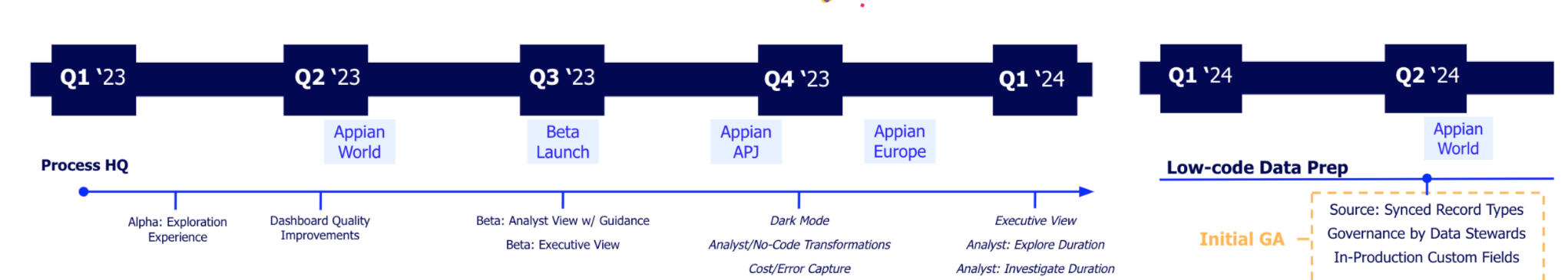
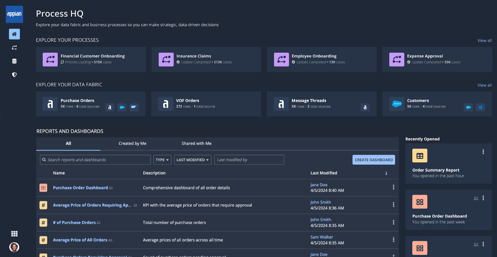
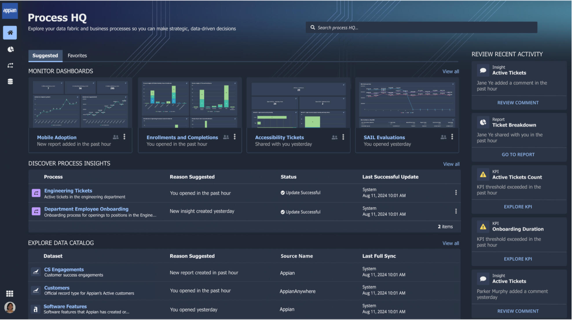
Process HQ
Environment

Problem
Enable users to understand how their processes are performing, discover bottlenecks, and discover areas of improvement.

Users
Main users of this environment want able to monitor key data for each of the processes that they are responsible for. Breakdown of key personas can be viewed below.

My Role
Lead designer focused on overall dark theme and environment styling guidance. Conducted reviews of three other junior designer's UIs and user flows. Worked with another lead designer on parallel team.
Background
In 2021, Lana Labs was acquired by Appian, which introduced a Process Mining tool within our product toolkit.Process Mining allows users to understand how their processes are performing - identifying bottlenecks and discovering areas of improvement.We wanted to utilized this tool to create a new Appian environment where business analyst could monitor their processes and discover insights: Process HQ
General Timeline
Prior to Q1 of 2023, I had been one of two senior designers on the Process HQ Beta team - building out the first process HQ experience for Beta customers to provide feedback. Starting in Q1 of 2023, we began planning ways to productize the tool. It would be my job to oversee the design direction and design consistency across the Process HQ teams involved in this multi-quarter effort.
The Team
Alpha Pod
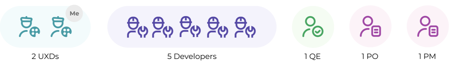
I was one of the core designers on the alpha pod. We had to iterate and design quickly to create a working fully working application in a short timeframe. The junior designer and I had daily syncs with each other and the PO and PM in order to get feedback fast and make changes accordingly. In some cases, we made our designs in SAIL to speed up development.
Productization Teams
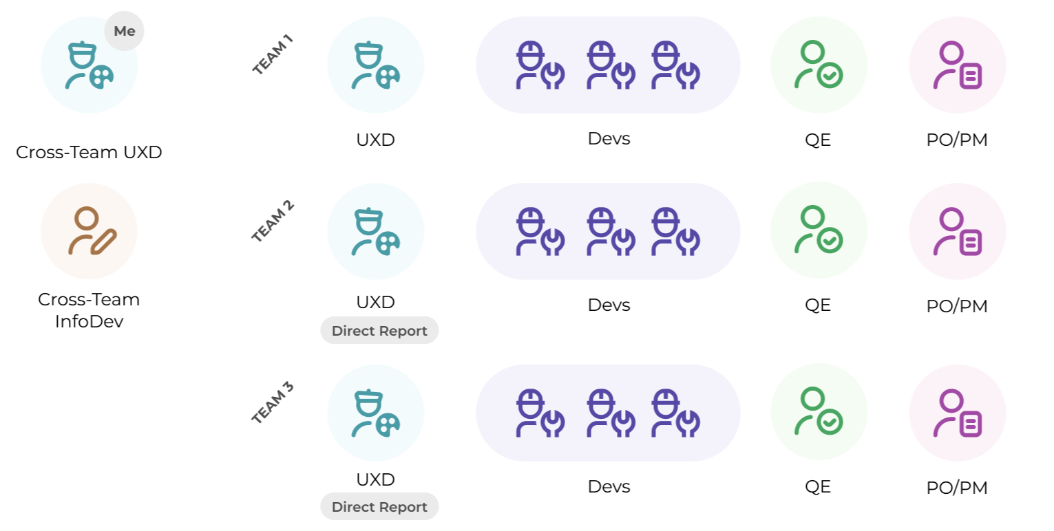
Once we proved out the vision with an initial working solution, we expanded the effort to work on productizing the Process HQ environment. I worked across multiple teams and timezones (US and Germany) to think through design strategy and provide assistance where needed.
Junior UXDs - I had 2 direct reports on two of the teams, so I worked closely with them to provide UX feedback.
Lead UXD and POs - I had weekly session with the other lead UX designer and collaborated with the POs across the team to understand cross-team priorities
InfoDev - It was also important to work with the cross-team Information Developer (InfoDev) to understand content strategy for this environment.
Personas
To ensure we had a cohesive story to tell, we also needed to be aligned on our key personas across this new environment:


Areas of Focus
As I worked across teams and conducted UX reviews of junior designers, I also had a core area of focus:
Ensure design consistency for Process HQ environmentAs a result, I worked on certain resources such as a design guideline doc as well and working on a vision for the environment landing page. The goal of the landing page would be to highlight the two core areas of the environment: Process Insights and Data Fabric InsightsYou can see more about my general approach for the landing page below:
Inspiration
I first wanted to look at core patterns across landing pages and specifically wanted to get a feel for dark theme landing pages. For context, the rest of the Appian product has always been in a light theme, and it was part of my job to provide guidance on how this new environment would be styled in a dark theme manner.


Environment Core Concepts
Before diving into what the landing page would look like, it was important to remind myself of the other key pages of the environment and how each core concept should tie back into the home page.
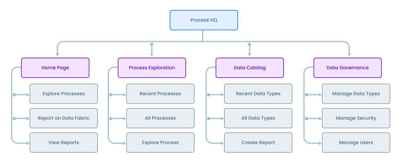
Initial wireframes revolved around a common side pane with a contents section that showcased the core object of that tab. You'll notice even the name of the environment was still being determined (Self Service Analytics vs Process HQ). A collaboration with leadership and marketing was required.

Workspace

Processes

Data


Alternatively for each core page, we could make recent objects easily accessible and allow users to filter/views specific objects based on what they were looking for. We'd need to consider what core action would need to be visible on each page.

Landing Page

Process Insights

Data Fabric Insights


Essentially, users would be able to analyze process and record data, and we wanted to promote those core pieces of functionality on the landing page.
Design Iterations
I went through a number of design explorations, playing around with key action location, background styling, and object card styling.


User Testing
Conducted a usability sessions with 6 participants. We wanted to have users of different experience levels and roles. Users were asked to explore the landing page and click through a sample flow.
What People Liked Most
Visual Dashboards: The dashboard previews were generally well-liked for their visual component.
Recent Activity: The recent activity section was seen as helpful and useful.
Organized Sections: The organization of information into smaller sections was praised for making it easier to find things.
Overall Aesthetic: Some people liked the overall aesthetic, including the gradient background.
Key Areas of Opportunity
Clarity and Simplicity: Reducing visual clutter and making the purpose of each section more obvious.
Guidance and Onboarding: Providing better guidance for new users to understand each section's functionality.
Personalization/Customization: Allowing users to customize their home page, like pinning favorites and controlling suggested items.
Terminology: Refining labels and messaging to be more action-oriented and less ambiguous.
Data Catalog Explanation: Making the purpose and use of the Data Catalog clearer.
Spacing and Layout: Adjusting margins and spacing to reduce the feeling of being crowded.
Responsiveness
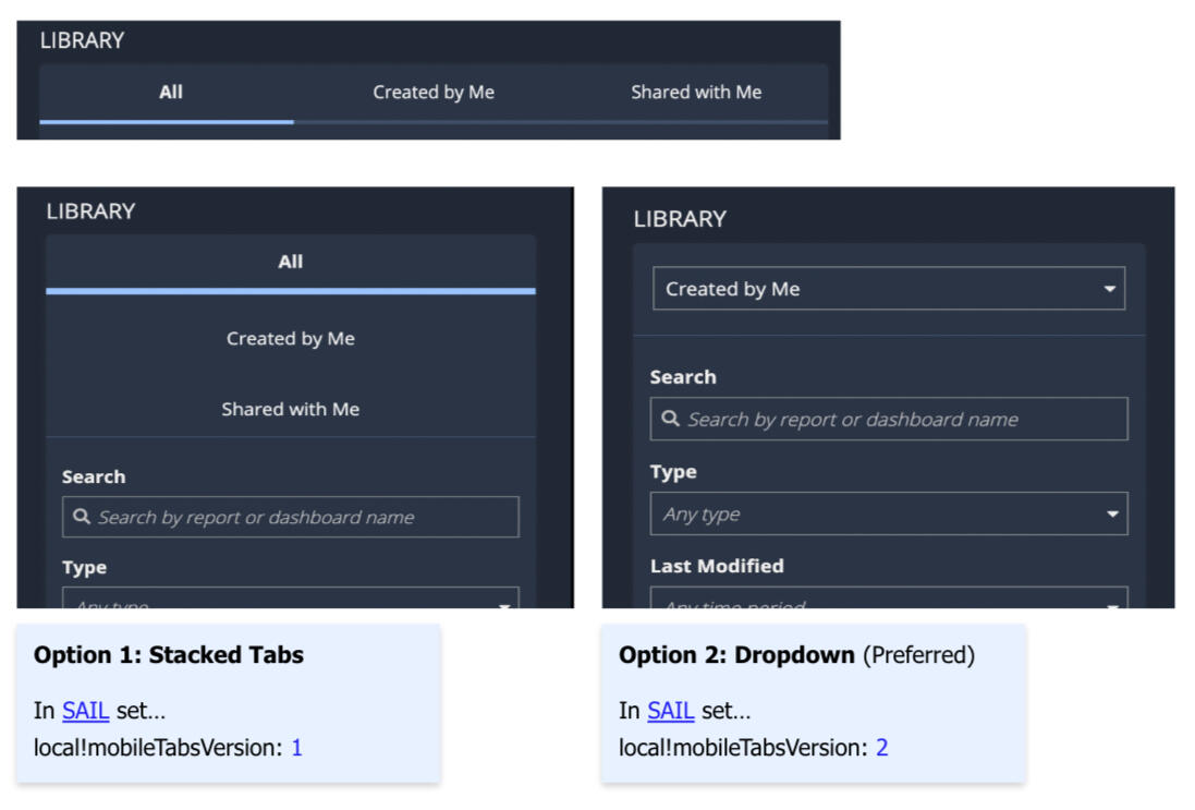
Tabs
Horizontal tabs need to more efficiently take up space to avoid text wrapping or truncation.
Option 1: See all tab options in a vertical list
Option 2 (Recommended): Tabs turn into a menu dropdown
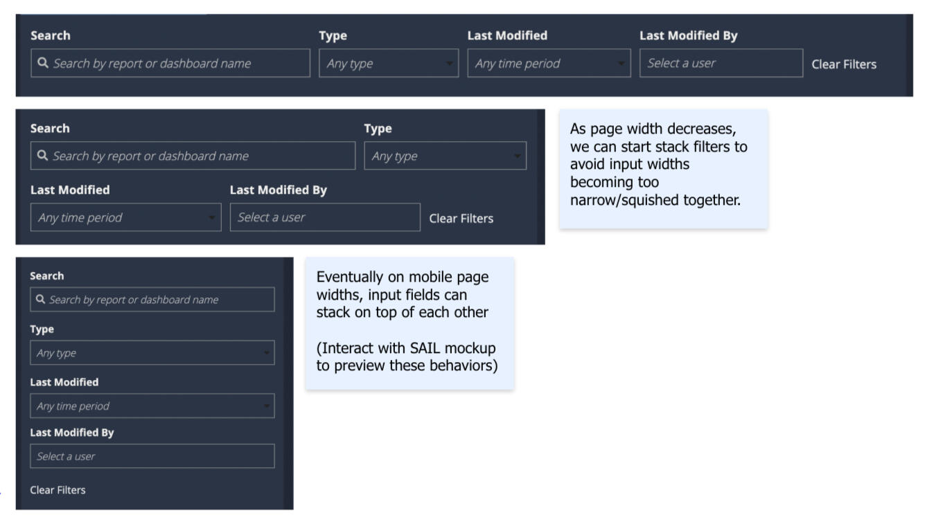
Filters
Filter input fields need to stack onto multiple rows to avoid the container widths becoming too small.
Filters row becomes two rows on narrow pages
As page decreases to a mobile page width, filters stack on top of each other.
Final Design
The final design of the landing page prioritized:
Viewing recently created record reports and dashboards
Showcasing the ability to explore other process and data fabric records
You can checkout the latest Appian Release notes, highlighting Process HQ below:
Design Guidelines
Another one of my side deliverables was creating the design strategy for this new environment. To the right, you can see some of the design guidelines I was working on to make sure that designers and developers knew the direction that we wanted to take for the environment.
Usage Impact Testimonials
Team discovered an unexpected process flow and implemented a change the next sprint to block it. 3 insights have a potential savings of 62,295 days annually. "This would have taken us hundreds of hours to find without Process HQ!" - Product Owner at Vanguard
"It only took me 25 minutes to get from a question to an actionable insight. That wouldn’t have been possible without Process HQ." - Senior Business Analyst at Allan Gray
Team found a vendor was violating their SLA over 90% of the time! In the past, an analyst spent 2 days a month manually analyzing logs to identify SLA breaches. “This is much quicker and more robust than any analysis we were previously doing." - Director of Operations at Lazard
Future Exploration
Page Layout
Global search across the environment
Ability to track "Favorites"
Improved dashboard previews
Auto suggest objects based on activity or relevance
A section for recent activity to pick up where you left off
Environment Orientation
Display an initial welcome message
Introduce user to side nave section for navigation
Provide a core description of each section as initial guidance
Takeaways
Working across multi teams is a lot of work - at any given day for any given decision, you can have a lot of cooks in the kitchen. It's important to agree upon your key principles and goals so that you can make decisions quickly. As a UX team, we also learned the value of UX reviews within the development cycle and across squads. With the right amount of communication, you can catch design inconsistencies early to ensure that the experience across team features is cohesive.
Playlist Generator
Problem
Aenean ornare velit lacus, ac varius enim ullamcorper eu. Proin aliquam sed facilisis ante interdum congue.
Aenean ornare velit lacus, ac varius enim ullamcorper eu. Proin aliquam sed facilisis ante interdum congue.
My Role
Aenean ornare velit lacus, ac varius enim ullamcorper eu. Proin aliquam sed facilisis ante interdum congue.
Research
Design Iterations
Takeaways
Video Session App
Research
Before designer, I interviewed squad coaches, product managers, and designers to discover what functionality they were looking for. Not surprising, each user had different needs, so the main goal was to try to find the typical use cases and allow the sprint map to support those cases.Since there are plenty of existing sprint maps and planning boards out there, I also looked to those as references (JIRA, Trello, etc.) It was interesting to see how data was represented and what editing capabilities are provided.
Design Iterations
First design utilized our card components. Unfortunately due to the limited text functionality at the time, I couldn't truncate the text and instead we ended up with text wrapping. We would have to add custom logic to truncate the text after a certain amount of characters. This first idea focused on showing the planned features across a period of time.
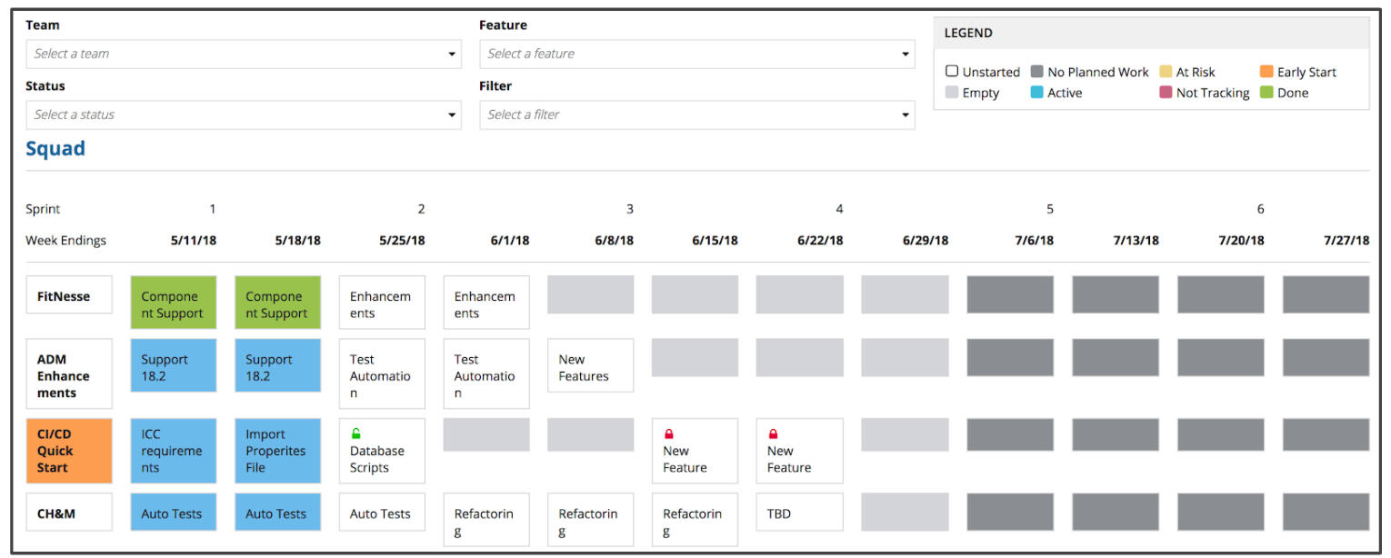
When selecting one of the cards, users would be shown details about that feature and could edit the information from the side panel. The con of this was that it further squished the data on the left.
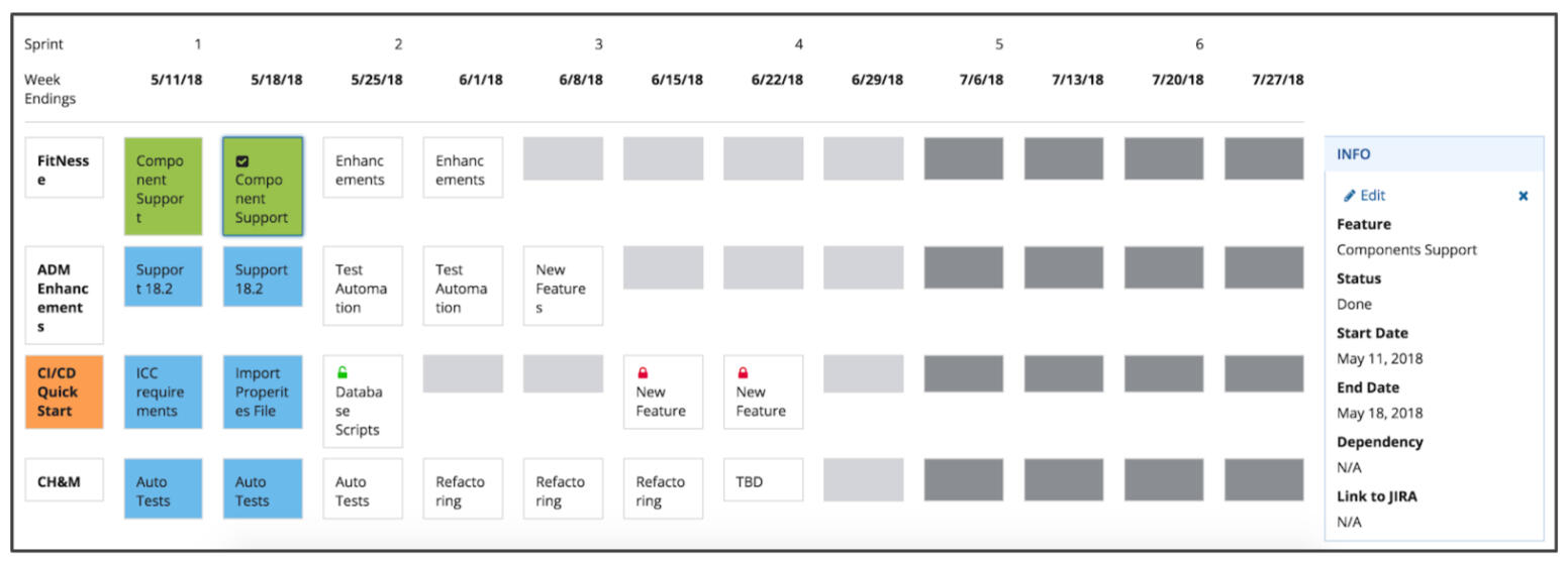
The next iteration focused on an editable view where we focused on inline editing for that goal. We wanted to have an easy way to read the features across the page and take advantage of the typical wide screens this will be viewed on.
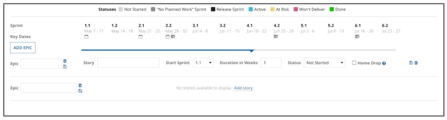
Later, we added the ability to move and add on different feature lines so that users didn't have to reorder if they added features at the end of the list.
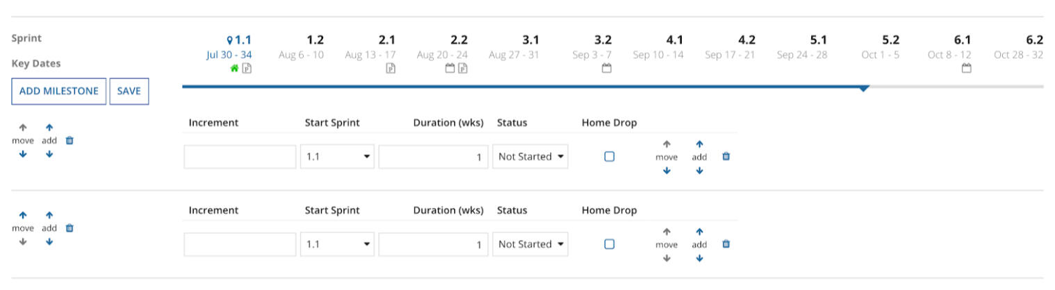
The final read-only view incorporated smaller bar images so that we could fit more information on the page. We also moved the text above the bars to reduce text wrapping.
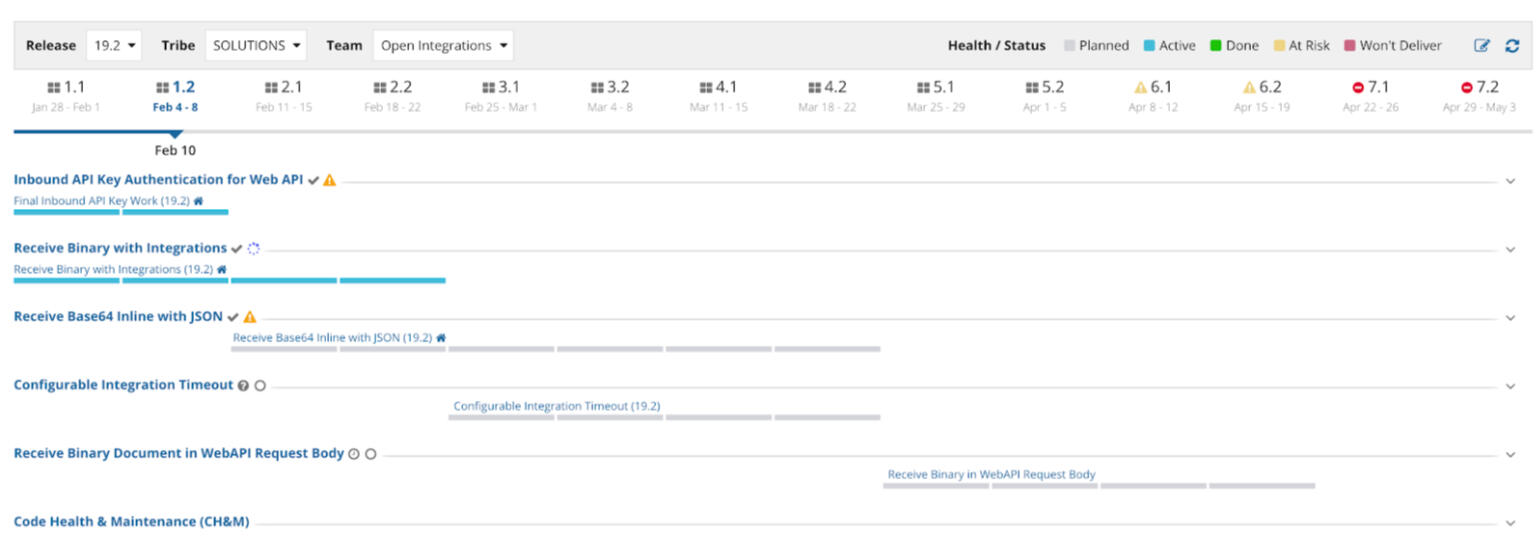
This is one of the final iterations of that first design. Here we are in the edit view where you can edit multiple features at once.
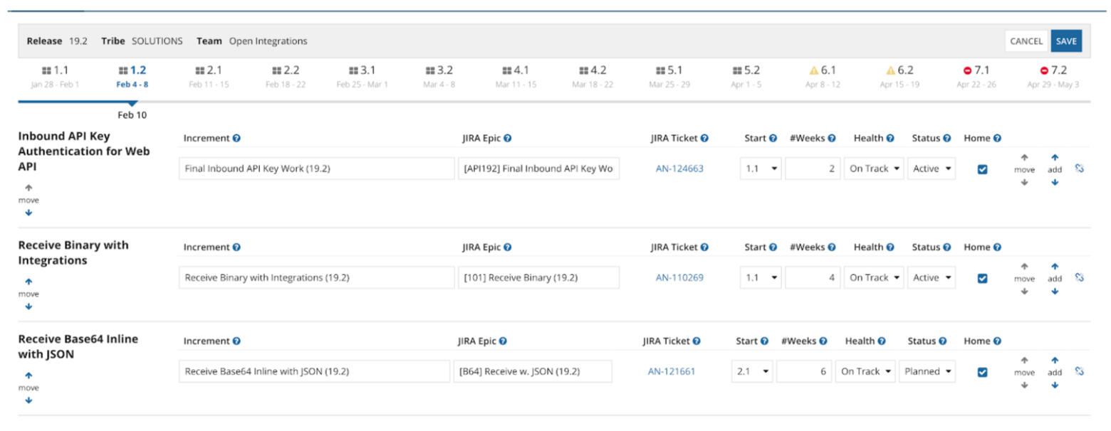
Takeaways
When designing something where different users have different needs, it's important to focus on the main paths for the main users. You can't please everyone, but you can try to make the common actions easy (at least for the MVP) and then later you can work toward future enhancements.

Sugar & Rice
When designing something where different users have different needs, it's important to focus on the main paths for the main users. You can't please everyone, but you can try to make the common actions easy (at least for the MVP) and then later you can work toward future enhancements.
Punderful World
2023

Kitty Cat

Seal of Approval


Sugar & Rice
2023
Kitty Cat

Seal of Approval


UX Design Lab | Mobile and Responsive Design
The 4th session of our UX Design Lab livestream series on the Appian Community channel. We discuss responsiveness best practices to make your UIs both usable and accessible.
UX Design Lab | Color Usage
Our second UX Design Lab livestream where we discuss how to best utilize color within your UIs, taking into account branding, user goals, and accessibility.
Build from Inspiration | Learn with Experts
In this livestream, we focus on how to create attractive and usable interfaces with the SAIL Design System. Alongside my colleague Robin Sultan, I’ll be sharing our expertise as we recreate a real website in Appian.d
Appian Functions: Creating Dynamic Interfaces
An Appian tutorial where I'll walk you through how to utilize the match function to create dynamic interfaces.
UX Design Lab | Using Grids
The third video in our UX Design Lab series! Jenny Higa and I walk through different grid use cases and provide guidance for how to make your data clear and actionable.
UX Design Lab | Dashboard Design
Our first UX Design Lab livestream! We reviewed information-dense dashboards submitted by the Appian developer community. We shared practical tips and redesign strategies to help make complex dashboards more intuitive and user-friendly
Appian Quick Builds | Calendar Component
Utilizing the dataless design approach discussed in the Design Library livestream, we review participants best calendar component.